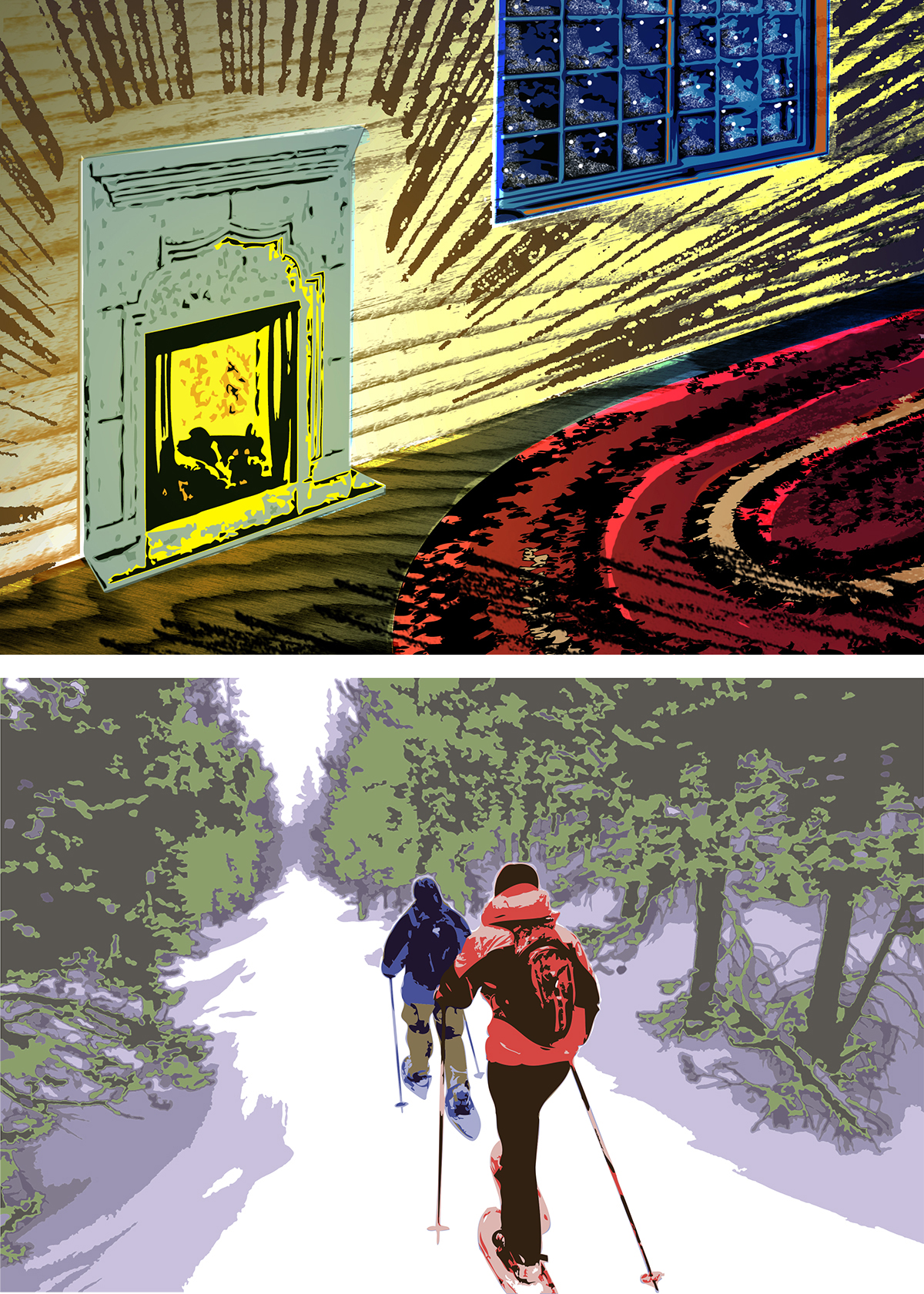
I wanted to do a nice holiday card with a warm, hand-made touch by collaborating with a local letterpress company. The first picture here is my sketch of the concept: a cozy fire casting light across a small rough-hewn room and a wool rug while outside everything is still and dark. I considered how texture and tone could overlap from different layers. Then the budget-o-meter hit zero, so I created the second design inspired by the old oil-based paint-by-numbers kits with a limited color palette. It works, but doesn’t have the same mood as the original idea.
