The New Logo is Here!

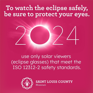
Saint Louis County launched a new brand January 1 of 2024. New logo, new colors, new fonts… the whole shebang! My job became rollout specialist at DPH. New materials needed to adhere to brand guidelines, and existing materials updated as needed. Imagine every form and brochure a health department has. Everything from brochures and annual reports, to the form you fill out to provide consent to your tattoo artist or body piercer.

This social media post had fun with the bright new “rose red” and a message to safely enjoy the astronomical wonder of the April 2024 solar eclipse.

You can see more about the new brand (and swag!) at this link.
https://stlouiscountymo.gov/st-louis-county-government/county-executive/our-work-so-far/our-new-branding/

Community Health Improvement

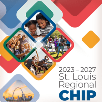
A Community Health Improvement Plan (CHIP) defines the strategic vision for the health of the community through a collaborative process that addresses the strengths, weaknesses, challenges, and opportunities that exist to improve the health status of that community.

This report uses a lot of data from several different sources. The trick for this 47 page report was to make all the pieces work together with consistency. The color similarities in the partner logos set a basic palette to use throughout. Secondary and accent colors are derived from other graphics and illustrations provided by the three organizations. Typographically, there could be better consistency, particularly with table data and graphics. But design limitations arise when County DPH and City DOH provide different elements with different directions during a perpetually looming deadline.

But I’ve always liked designing multi-page documents and data visualizations, so here’s another example.

Getting to the CORE

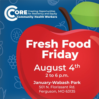
Another logo design, this one for a health initiative of Saint Louis County DPH. Creating Opportunities for Resiliency and Equity (CORE) is an initiative to improve the health of St. Louis Promise Zone residents in the wake of the COVID-19 pandemic. This shows a one-color version of the logo used in a social media post. Getting both the initiative name, and identifying staff as “CORE Community Health Workers” in one graphic is a challenge.

The graphic itself is essentially a C at the “core” of another C in a recognizable target motif that draws the eye to the very center. With enough exposure and repetition, a simplified version can be used when available space or particular need calls for it.

https://stlouiscountymo.gov/st-louis-county-departments/public-health/core-community-health-workers/

Gun Violence Awareness

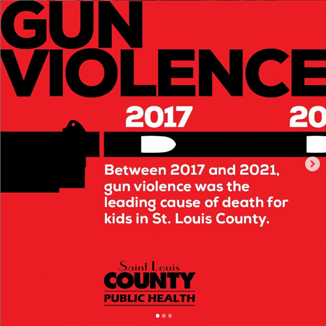
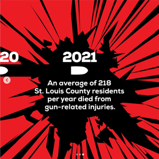
Every St. Louis County resident deserves to live a long and healthy life. However, gun violence kills more than 200 residents each year. And children in the County are more likely to die from gun-related injuries than from any other cause.

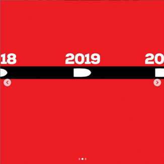
For National Gun Violence Awareness Month, DPH wanted to bring awareness to the impact it has in our community. The data spans 5 years so this design takes advantage of the swipe function in social media to create an interactive timeline. Bullets mark each year, traveling both through time and through the three panels. What begins as a calm black line shatters at the impact that gun violence has on people’s lives.

https://www.instagram.com/p/CuFsYW_uRW0

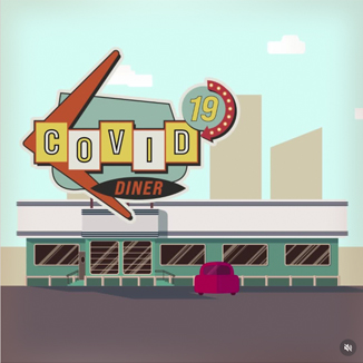
Covid Diner – motion

During the height of the COVID-19 pandemic, communication channels were saturated with information. Some helpful, some not. Novelty can draw in audiences whose eyes have become numb to the clutter.

By modifying stock illustrations and storyboarding simple animation, I worked with other members of the creative team at Saint Louis County Department of Public Health to create this animation with a clear message: if you’re sick, stay home. Admittedly, this prescription can be difficult or impossible for those without the option to miss work.

Click the image to go to the Instagram post and see the animation.

Tackling Freelance

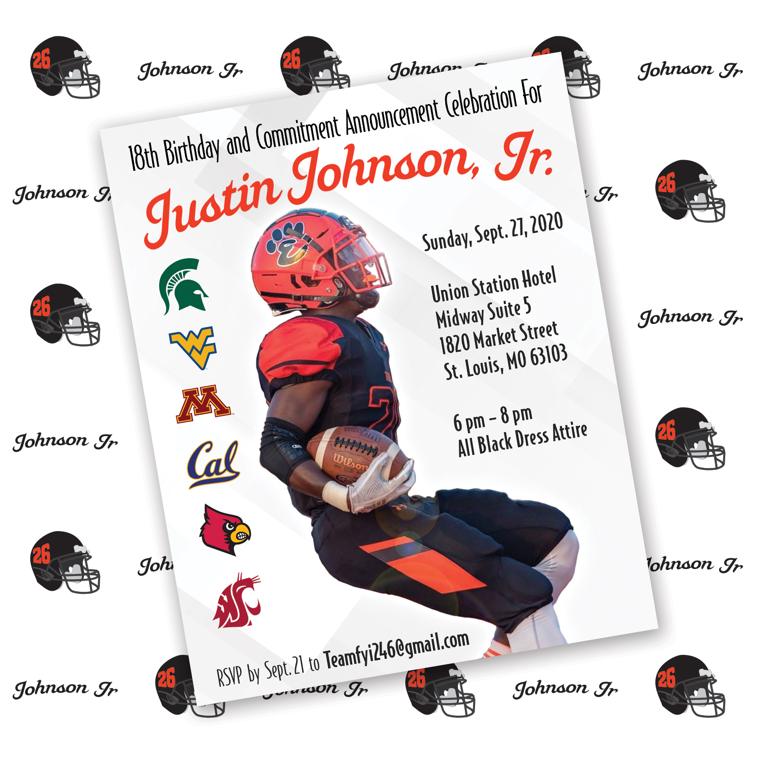
Johnson_cover

Trying to keep busy while I continue the search for the next stage of my career as a graphic designer. A friend who is an event planner was organizing a party for a young man who was turning 18-years-old AND announcing which college football program he was committing to. He said local and national sports media would be attending.

We discussed many ideas, including a mailed invitation made to look like a player’s football card with stats on the front and event details on the back. As time and budget details got worked out we settled on an e-mailed invitation graphic and a step-and-repeat background for photo opportunities. It’s been a long time since I was a high school senior so I needed clear discussions on Justin’s preferences and influences for the design.

In the end they were thrilled with the materials, which included graphics for use in Word documents and PowerPoint presentations. And the sports section of the St. Louis American reported he gave his commitment to West Virginia.

Making Faces

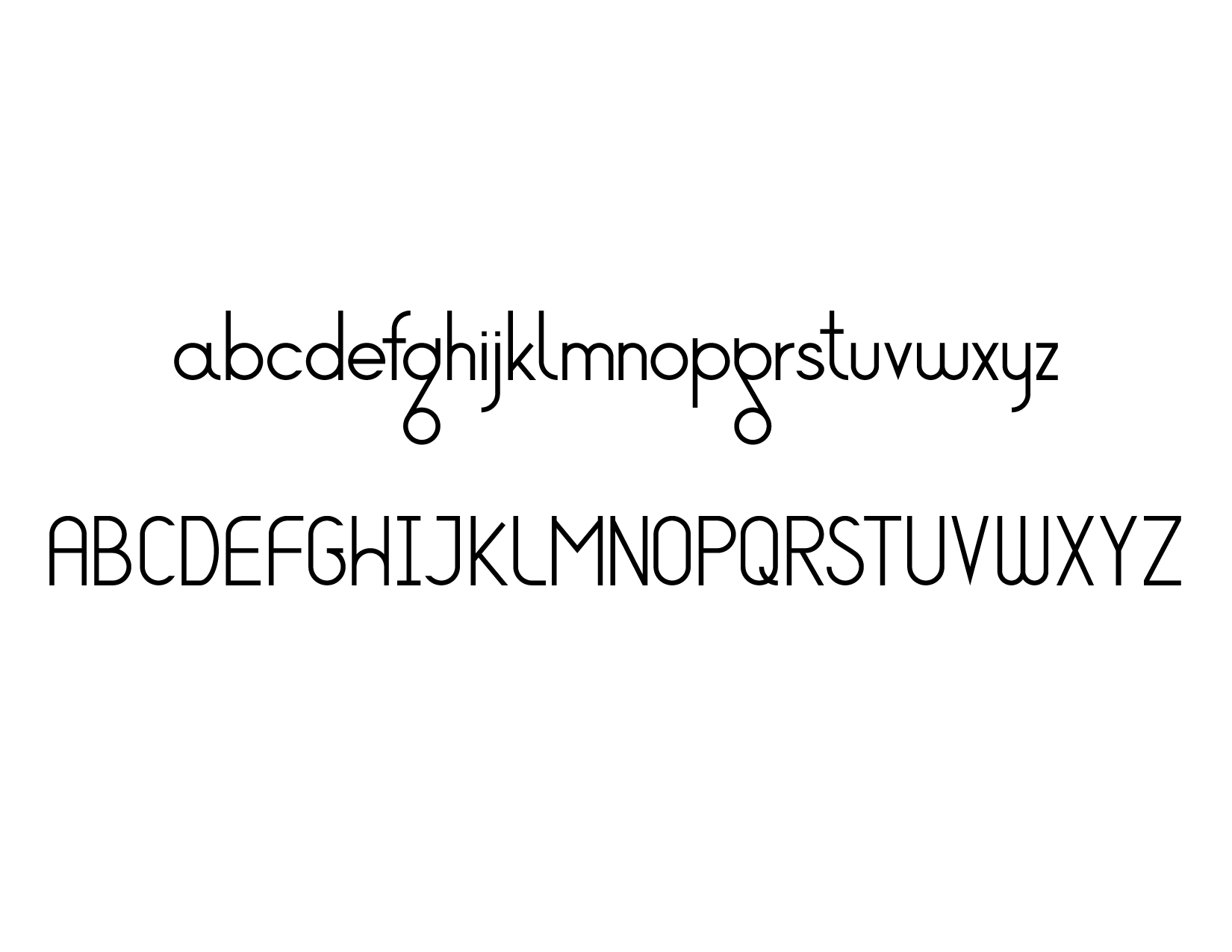
gq_gothic_cover

I was doodling letter forms during a meeting and hit upon a design I wanted to pursue further. It began with the lower case “g” and “q” shapes having simple circles connected by a diagonal line, almost like a pulley or film on reels. And I thought about how a g and q could be the same identical shape—only flipped—and still recognized as different letters. From there I structured a framework of shapes and proportions and built the other letters to match the style.

After putting the idea away for a while I was compelled to return and assemble uppercase letters as well. Maybe numbers and symbols are next. Making an “s” is so much harder than I expected!

Breathe Easy

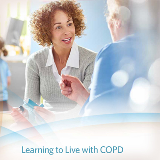
COPD-cover

This design required a little bit of everything. The content for this patient guide to COPD treatments was assembled from several different sources and had to be given a cohesive look. Some existing illustrations were updated to have consistency of color and typography, while others like the dry powder and Respimat inhalers I created from scratch. This clean, bright layout avoids visual distraction. It is critical for health information provided to patients be clear and accessible.

Cardio Workout

Vein_Treatment_cover

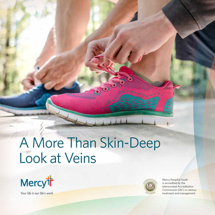
Digital publications have their own unique qualities. A guide booklet that is not going to press doesn’t need to have the typical “divisible by 4” page count for proper pagination. Seven page PDF? Sure, why not. But all the core principles of composition and typography remain as important as ever. Digital publications can also feature interactive content like bookmarks, hyperlinks, and embedded video to be more useful and engaging to the reader. This example has a simple URL link on the last page to guide readers to Mercy’s website where they can continue to engage and act immediately on the information they have read.

Medical Practice

Mercy_cover

I started a contract gig in August, 2018 with Mercy. Coming full circle in a way because my first job ever was temp-to-perm at BJC HealthCare. It’s crunch-time at the end of the year and I’m working on a little bit of everything: PowerPoint presentations, maps, infographics, posters, ads, you name it.

Mercy has hospitals and clinics spanning four states but the marketing efforts are centered in St. Louis. To achieve a unified look, or “One Mercy,” they start with a strong brand and identity guidelines. This is a benefit not only to maintain consistency, but has also made it easy for me to understand the brand values and hit the ground running. Continue reading