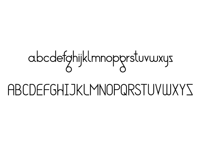
I was doodling letter forms during a meeting and hit upon a design I wanted to pursue further. It began with the lower case “g” and “q” shapes having simple circles connected by a diagonal line, almost like a pulley or film on reels. And I thought about how a g and q could be the same identical shape—only flipped—and still recognized as different letters. From there I structured a framework of shapes and proportions and built the other letters to match the style.
After putting the idea away for a while I was compelled to return and assemble uppercase letters as well. Maybe numbers and symbols are next. Making an “s” is so much harder than I expected!
