A work in progress. My brother started a food blog and wanted a logo that could be used across the social media environment. His writing style cuts right to the heart of the story. How can the letter forms evoke the sharpness of the blade and the wit? I had to think vertically, horizontally, and… squarely. I see some things I’d like to continue to refine but so far this has been a creatively rewarding experience. Get a taste at Pen + Knife.
Author Archives: ryanweis
Food Insecurity Report
The Health Equity Series of reports looks at how socio-economic differences can impact health outcomes. This report in an accessible yet detailed look at the issue of food insecurity. It provides various visual displays of collected data, and includes “spotlights” of organizations that provided resources for the report, and which worked towards the goal of Healthy People 2010 to reduce the national prevalence of food insecurity to 6 percent of households.
Eat Smart Logo
Eat-Rite or don’t eat at all. And if you can’t do that, eat smart. A childhood obesity prevention effort wanted a way to brand healthier food choices in stores and school cafeterias. The simple bold colors and shapes are meant to help this identifier stand out on shelves and menus. Originally I sketched hand-drawn letters that fit the apple shape but decided to start with an actual font and extrapolate from there. This would provide some continuity to the letter forms. Oh Hobo, how I’ve missed you.
Issues in Missouri Health Care
The latest version of a report compiled every couple years to educate lawmakers and community stakeholders on the health issues effecting Missourians. The report arrives as 12 separate reports and an executive summary that must be formatted into a single (hopefully compelling) document.
This is the first version that incorporates the foundation’s new identity, using the playful iconography and colors of the new brand. Inside, the focus remains on the clear academic reporting of the issues, enhanced with simple graphs and graphics to compel focus on these important topics.
A Triumph!
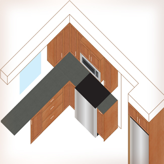
The creative triangle. Kitchen creativity is drawn from the fridge and the fire and the sink. Food storage, food prep and cooking. What was once a 10×10 foot kitchen with the fridge behind another wall is now an efficient functional workspace.
It’s still sort of a 10×10 (or 6×6 if you’re only counting the room you have to work in. Countertops eat up a lot of space). Sure it meant moving a door and tearing out a wall and all new plumbing and electrical and gas, but is it ever worth it!
I cannot recall another creative problem-solving project that consumed so much time and energy but resulted in such a feeling of success.
Illustrating in Illustrator
Plaster Chef
It’s Just a Jump to the Sketch

Hello graph paper my old friend. (OK, it’s no Simon and Garfunkel.)
There are so many approaches to building a kitchen from scratch! Custom, semi-custom, off-the-shelf Ikea stuff… At least there are some standards I can count on. First, I (arbitrarily) designated each quarter inch square to be 6 inches. A counter top is 36″ from the floor. Base cabinets are 24″ deep. Wall cabinets are 12″ deep, unless… Unless they’re from Ikea and Ikea happens to be completely changing their cabinet system from Akurum to Sektion starting in February 2015! And that new system happens to have 15″ deep wall cabinets.
Hello eraser my old friend…
New Adventures in Design

I wouldn’t want you to think it’s all brochures and websites that face the full brunt of my brain storms.
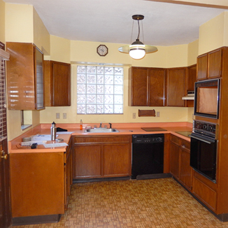
Winter 2014 the search began for a new house. And of course the perfect house was a project house. Just look at that vintage kitchen! All electric, lights shaped like UFOs, all the promise of a technological future (in 1955).
This project is going to challenge all my creative skills.
Holiday Card
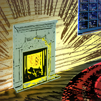
I wanted to do a nice holiday card with a warm, hand-made touch by collaborating with a local letterpress company. The first picture here is my sketch of the concept: a cozy fire casting light across a small rough-hewn room and a wool rug while outside everything is still and dark. I considered how texture and tone could overlap from different layers. Then the budget-o-meter hit zero, so I created the second design inspired by the old oil-based paint-by-numbers kits with a limited color palette. It works, but doesn’t have the same mood as the original idea.


