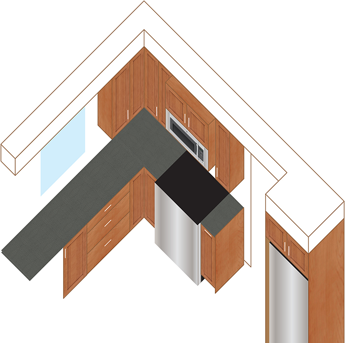
I tried some CAD-type software to do renderings but came back to my BFF Illustrator. Set skew to 30 degrees and start grabbing some photos and textures from the Ikea website. A simple stainless gradient from the default metallic palette will do for the appliances.
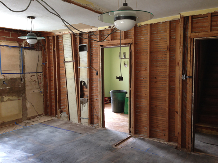
That kitchen had way too much… wall covering for my taste. Took out a transom doorway that split the kitchen in two. And we’re not afraid to move an exterior door to make better use of the space. Time to find out if my measurements are correct.
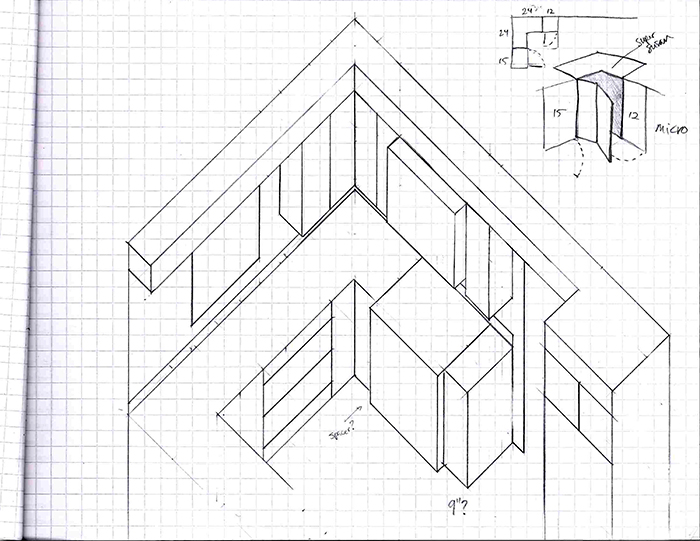
Hello graph paper my old friend. (OK, it’s no Simon and Garfunkel.)
There are so many approaches to building a kitchen from scratch! Custom, semi-custom, off-the-shelf Ikea stuff… At least there are some standards I can count on. First, I (arbitrarily) designated each quarter inch square to be 6 inches. A counter top is 36″ from the floor. Base cabinets are 24″ deep. Wall cabinets are 12″ deep, unless… Unless they’re from Ikea and Ikea happens to be completely changing their cabinet system from Akurum to Sektion starting in February 2015! And that new system happens to have 15″ deep wall cabinets.
I wouldn’t want you to think it’s all brochures and websites that face the full brunt of my brain storms.
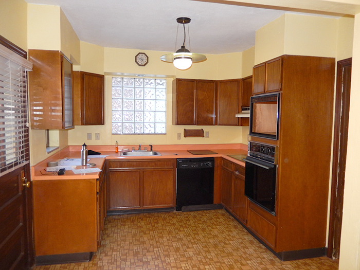
Winter 2014 the search began for a new house. And of course the perfect house was a project house. Just look at that vintage kitchen! All electric, lights shaped like UFOs, all the promise of a technological future (in 1955).
This project is going to challenge all my creative skills.
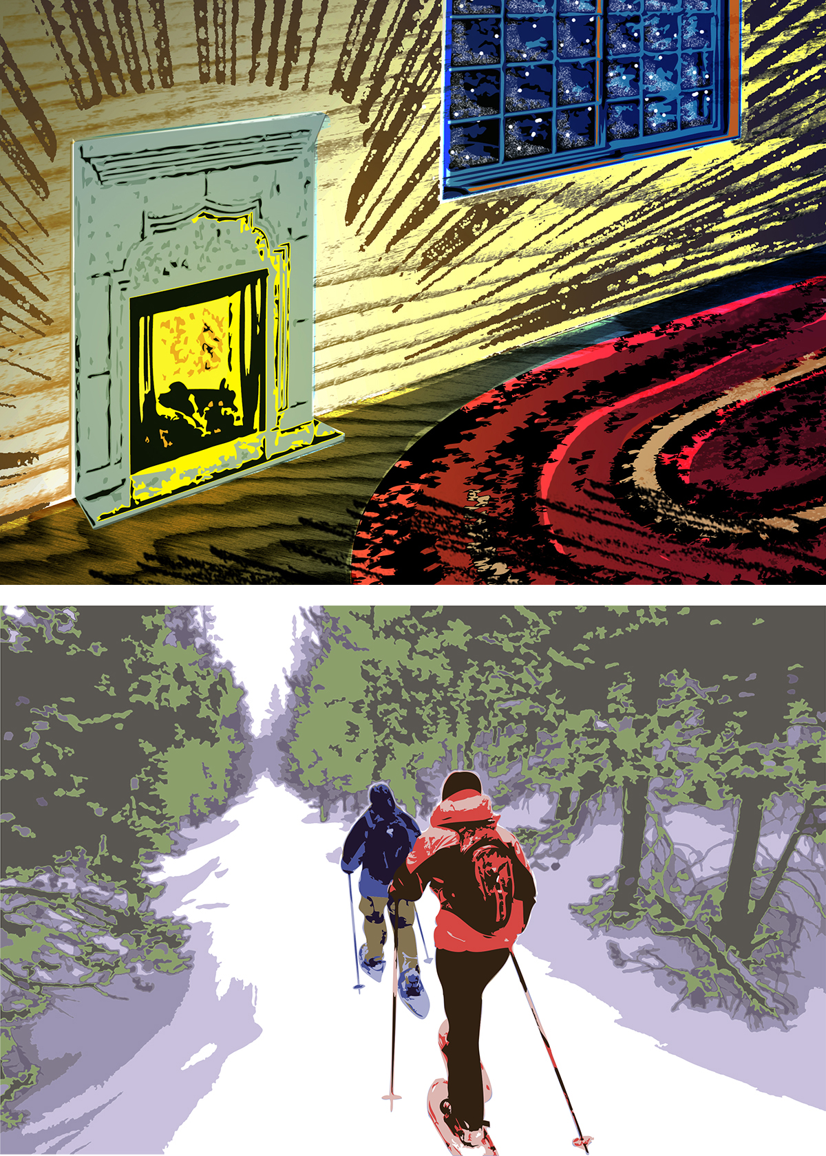
I wanted to do a nice holiday card with a warm, hand-made touch by collaborating with a local letterpress company. The first picture here is my sketch of the concept: a cozy fire casting light across a small rough-hewn room and a wool rug while outside everything is still and dark. I considered how texture and tone could overlap from different layers. Then the budget-o-meter hit zero, so I created the second design inspired by the old oil-based paint-by-numbers kits with a limited color palette. It works, but doesn’t have the same mood as the original idea.
This recipe book includes submissions by my colleagues for healthy food. I decided to go retro-camp with the design and included clip art and some of the most humorously unappetizing recipes from days gone by. Vintage wallpaper and material patterns serve as backgrounds for the imagery. Enjoy a Frankaroni Loaf at your next family meal!
A cut crystal bowl and financial grant serve annually to recognize Leaders in Health in honor of the late Dr. Walentik. This “W” design was proposed as the award’s identity, combining the initial letter W and the characteristics of the bowl’s cut glass patterns. Are your socks blown off yet? Mine neither, but it was a real task to translate a simple pencil sketch into a vector image that would actually work in different media. Even though my other design was selected, I enjoy the Escher-esque optical illusion when tracing my eye through this shape.
You know how it is. A friend asks if you can design a new logo for the St. Louis Scooter Forum and you think “well sure, why not?” So you do.
This graphic incorporates some very basic elements: the flag of St. Louis of course; a scooter that is sort of a hybrid of vintage and contemporary styles; a little bit of Lambretta and a dash of Vespa.
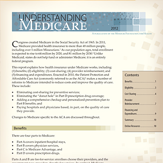
Understanding Medicare is a new series of health policy reports that serves as a companion piece to MFH’s “Medicaid Basics” series. The report required a modular page layout that would remain flexible to content and data updated on an annual basis.
A recent addition to a series of MFH reports that identifies health disparities among target populations. These data-heavy reports require clean page layout and the creation of clear graphs and graphics to provide insight in an approachable format.





 Ryan Weis: Portfolio