Rendering

stone_cottage_cover

A client was building an addition on a stone cottage they purchased to rehab. Drawings of the proposed garage with living space above needed to be submitted to the town’s planning commission before any work could begin. Using the hand-drawn elevations I created a perspective rendering to illustrate the finished structure. It was important to show how the addition would fit both the style of the existing house, but also with the neighborhood. Continue reading

Keeping Creative

Granite_patio_cover

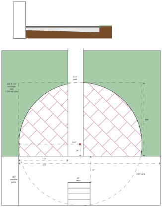
This is the second patio I have designed and built. I keep getting older, and they keep getting harder. Another designer assessed my concept drawing saying, “Putting square stones at a 45 degree angle from the straight edge wasn’t enough torture? You had to round the outside edge of the square stones! Being an artist, you wouldn’t want anything common and aim for the aesthetically beautiful.” And she’s right. Design is considered and thoughtful. A patio is space shared with the house and the yard and plantings and people. These all communicate with and influence one another, and a good design should listen to what they’re saying.

Granite_patio_sketch

Better Buildings Through Benchmarking logo

BBB_meter_logo_cover

They say you can’t manage what you don’t measure. USGBC-Missouri Gateway Chapter began a new campaign to improve energy efficiency in buildings—to reduce environmental impacts while simultaneously lowering utility bills—as part of the City of St. Louis Sustainability Plan. I developed this logo to brand news, information, and resources of the campaign using a color palette compatible with other efforts of the Chapter. The idea of “measuring/gauging/metering” data took me to the image of an analog graphic equalizer display on stereo receivers. And these columns readily call to mind buildings, from small to large. A cityscape of green buildings, each reaching for the goal of greater efficiency highlighted by the light green “peak” of performance.

Flames logo

Flames_logo_cover

A group of young girls, which includes my niece, started their own soccer team called the Flames Football Club. I was tasked with creating a graphic for their red uniforms. I went after something fun and dynamic that captures a sense of movement and energy. It’s a little bit hot rod and a little sporty. And my niece likes it so that’s all that matters, right?

Infographic

Infographic_cover

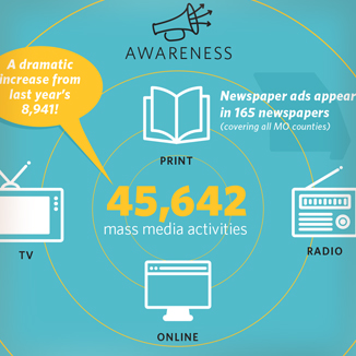
This infographic highlights three years of progress in the effort to enroll Missourians in a health insurance plan. This is really a look back at the work of the grantee organizations who provided hands-on services. Where do they feel they have made the most impact?

Pen & Knife

Pen_and_Knife_cover

A work in progress. My brother started a food blog and wanted a logo that could be used across the social media environment. His writing style cuts right to the heart of the story.  How can the letter forms evoke the sharpness of the blade and the wit? I had to think vertically, horizontally, and… squarely. I see some things I’d like to continue to refine but so far this has been a creatively rewarding experience. Get a taste at Pen + Knife.

Food Insecurity Report

Food_Insecurity_cover

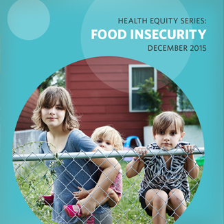
The Health Equity Series of reports looks at how socio-economic differences can impact health outcomes. This report in an accessible yet detailed look at the issue of food insecurity. It provides various visual displays of collected data, and includes “spotlights” of organizations that provided resources for the report, and which worked towards the goal of Healthy People 2010 to reduce the national prevalence of food insecurity to 6 percent of households.

Eat Smart Logo

EatSmart_cover

Eat-Rite or don’t eat at all. And if you can’t do that, eat smart. A childhood obesity prevention effort wanted a way to brand healthier food choices in stores and school cafeterias. The simple bold colors and shapes are meant to help this identifier stand out on shelves and menus. Originally I sketched hand-drawn letters that fit the apple shape but decided to start with an actual font and extrapolate from there. This would provide some continuity to the letter forms. Oh Hobo, how I’ve missed you.

Issues in Missouri Health Care

issues_2013_cover

The latest version of a report compiled every couple years to educate lawmakers and community stakeholders on the health issues effecting Missourians. The report arrives as 12 separate reports and an executive summary that must be formatted into a single (hopefully compelling) document.

This is the first version that incorporates the foundation’s new identity, using the playful iconography and colors of the new brand. Inside, the focus remains on the clear academic reporting of the issues, enhanced with simple graphs and graphics to compel focus on these important topics.

A Triumph!

kitchen_final_cover

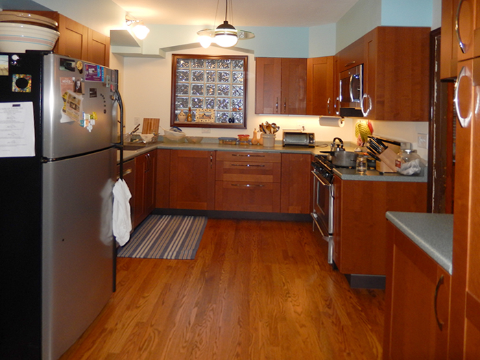
The creative triangle. Kitchen creativity is drawn from the fridge and the fire and the sink. Food storage, food prep and cooking. What was once a 10×10 foot kitchen with the fridge behind another wall is now an efficient functional workspace.

It’s still sort of a 10×10 (or 6×6 if you’re only counting the room you have to work in. Countertops eat up a lot of space). Sure it meant moving a door and tearing out a wall and all new plumbing and electrical and gas, but is it ever worth it!

I cannot recall another creative problem-solving project that consumed so much time and energy but resulted in such a feeling of success.